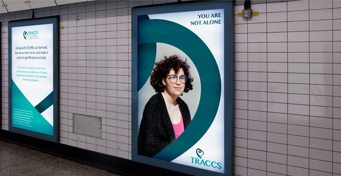
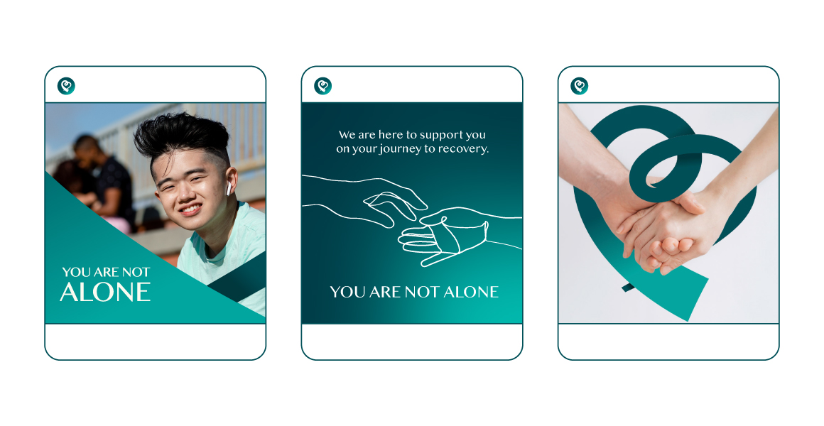
you are not alone
Brand Identity
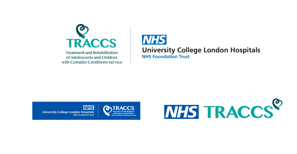
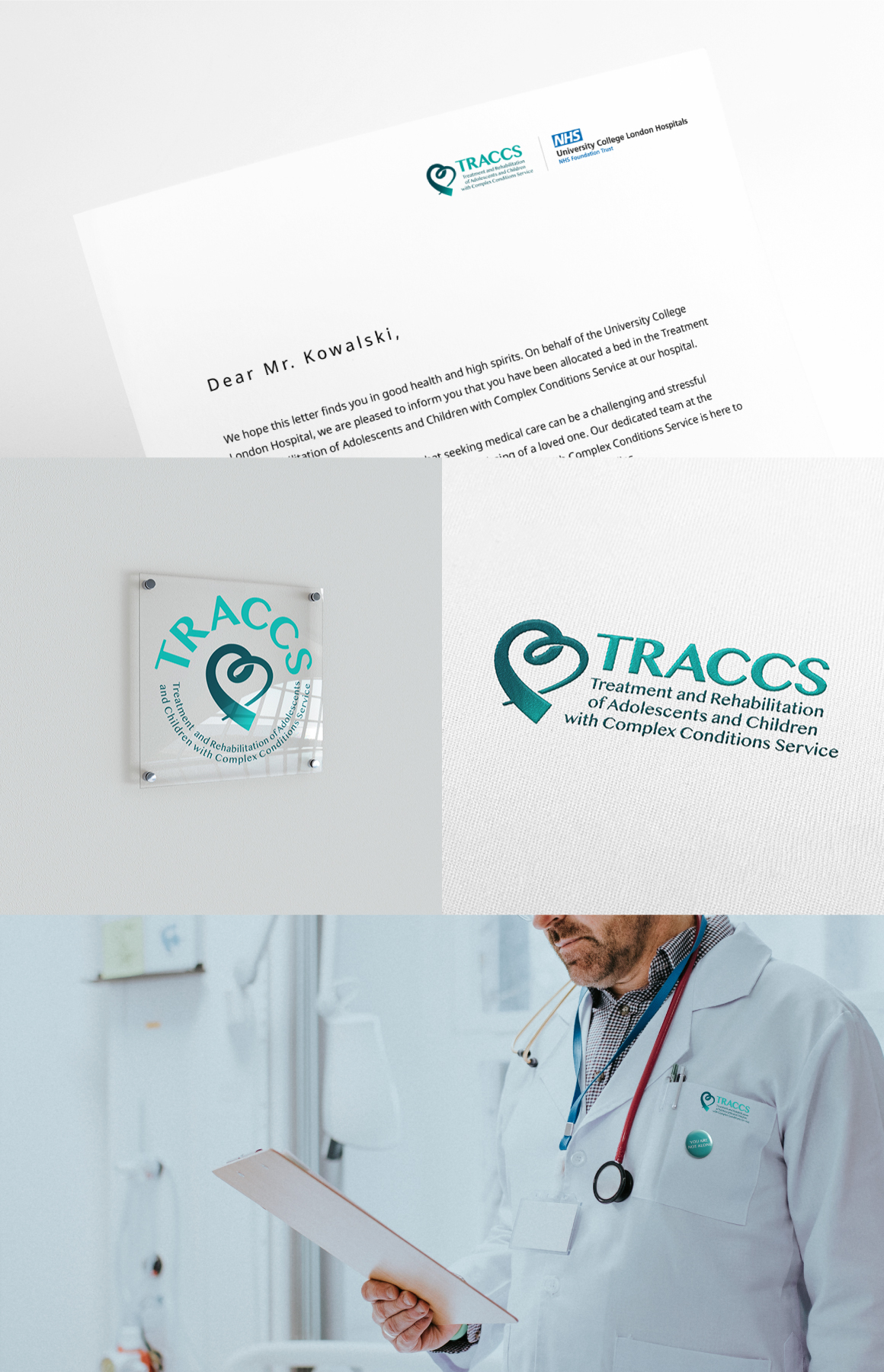
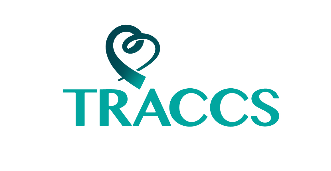
TRACCS
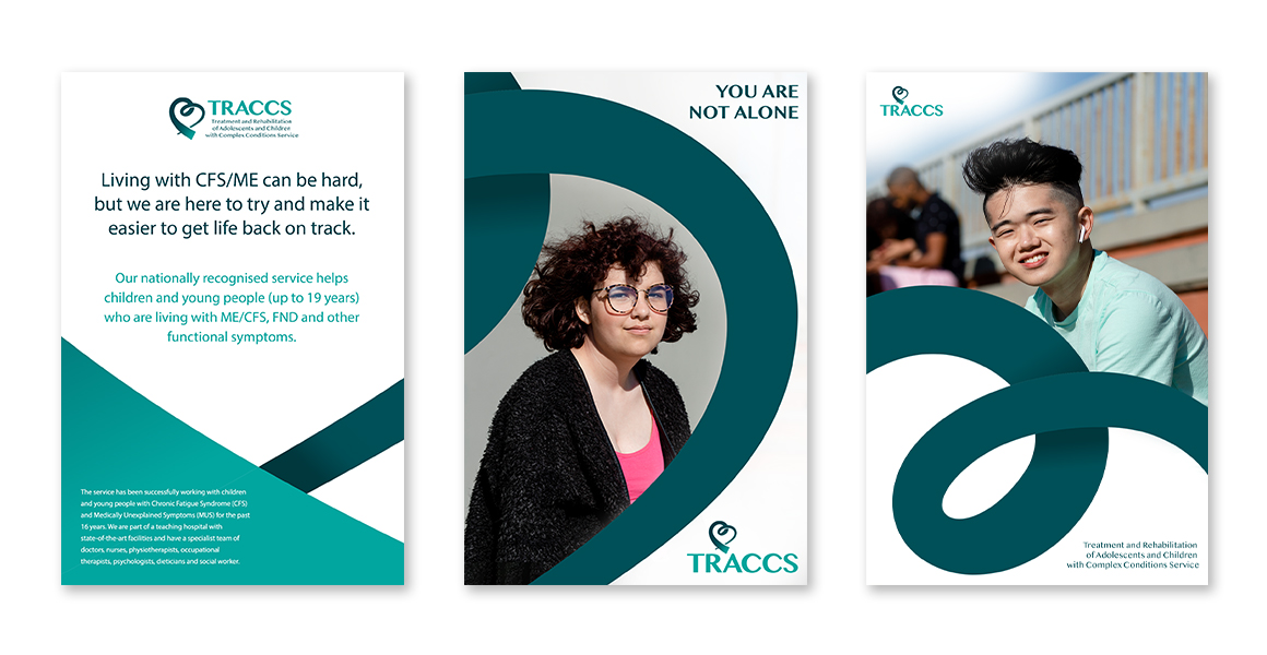
The service has been successfully working with children and young people with Chronic Fatigue Syndrome (CFS) and Medically Unexplained Symptoms (MUS) for the past 16 years. They are part of a teaching hospital with state-of-the-art facilities and have a specialist team of doctors, nurses, physiotherapists, occupational therapists, psychologists, dietitians, and social workers.
new logo & visual identity
Based on all the collected information about TRACCS, we concluded that the logo should be approachable, friendly-looking, evoking positive emotions and inducing good energy. Our goal was to create a strong brand identity with a clear and unique visual language that will give TRACCS the necessary recognition in years to come.
scope:
- logo system
- typography & colour
- visual language
- tone of voice
- brand guidelines
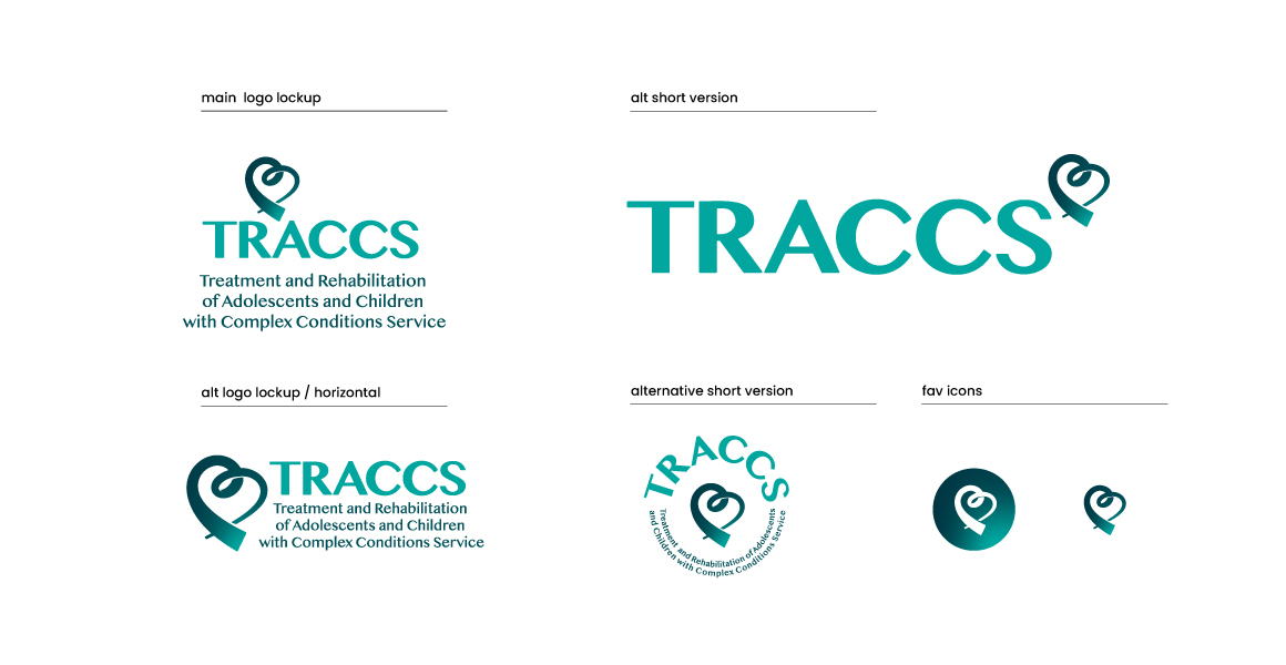
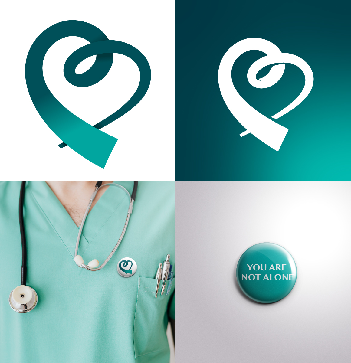
Heart-shaped journey mark
The main idea behind the logo was to do a race track in the shape of a heart. This would coincide with the name (excluding the obvious different spelling) and also be a good way of incorporating the fact that all patients move at a different pace. Recovery is not a race and everyone is able to get there in the end. Having the main mark in the shape of a heart will have connotations of health and wellbeing as well as the care that is provided by staff and professionals to those in need.