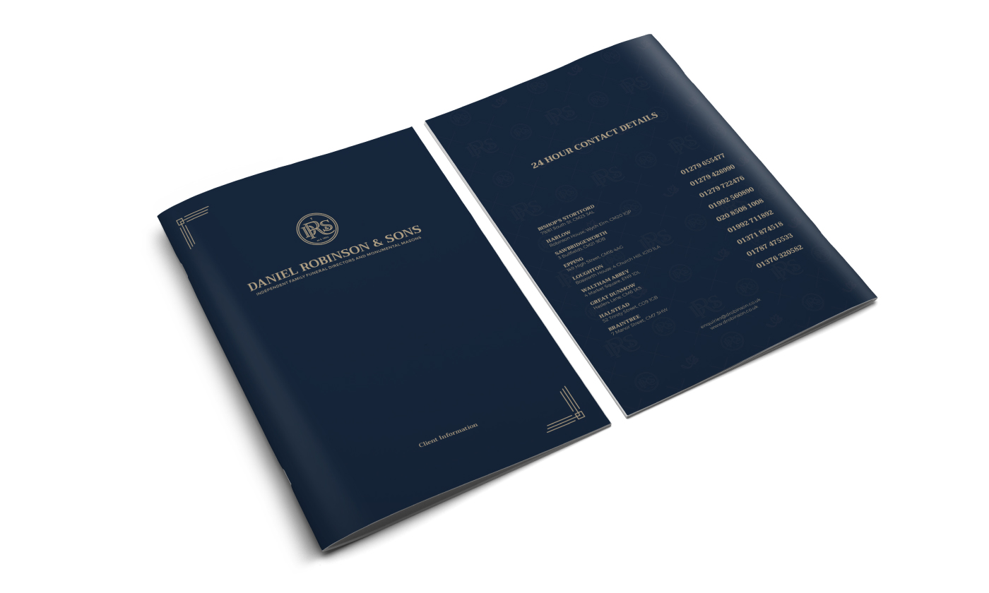
Daniel Robinson & Sons
brand identity
Daniel Robinson & Sons
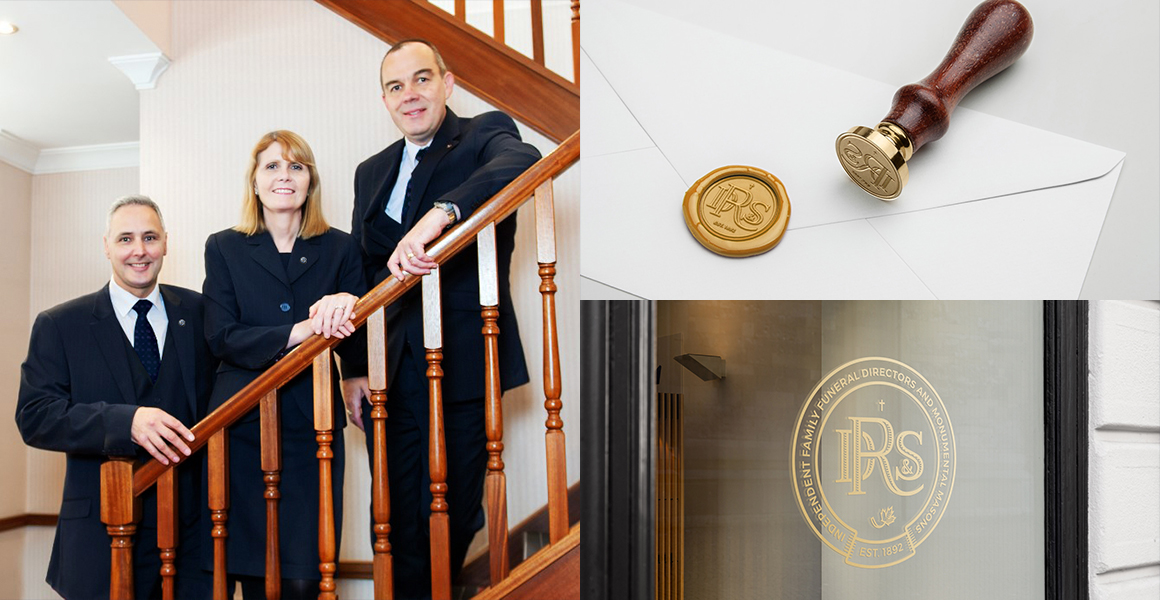
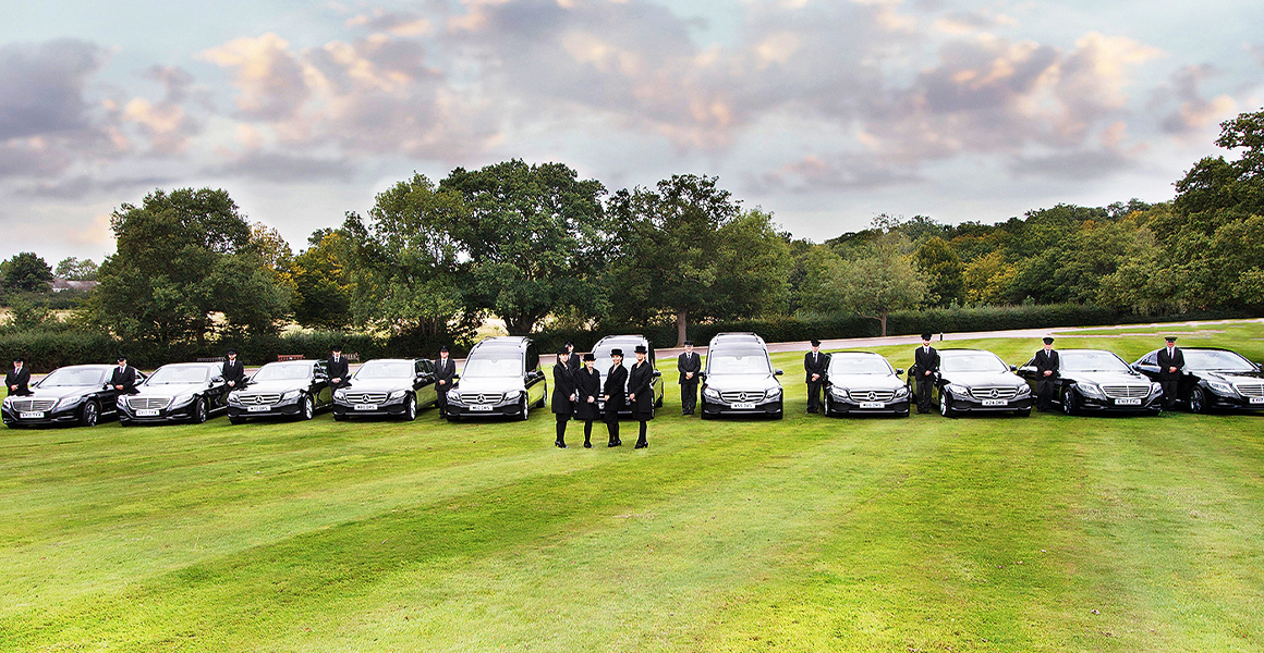
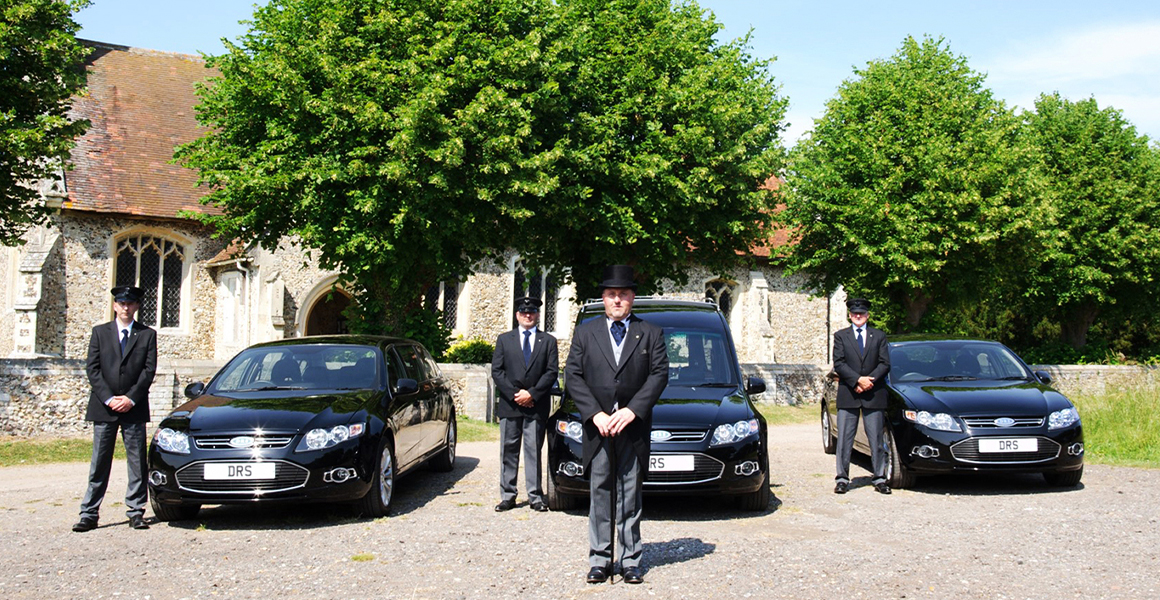
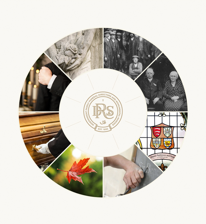
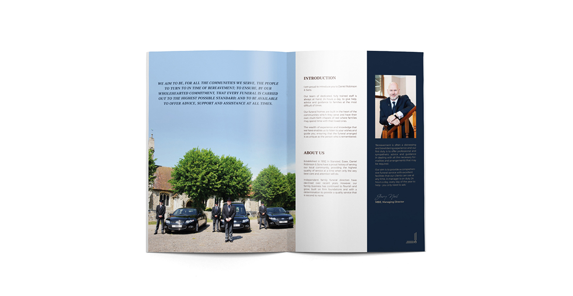
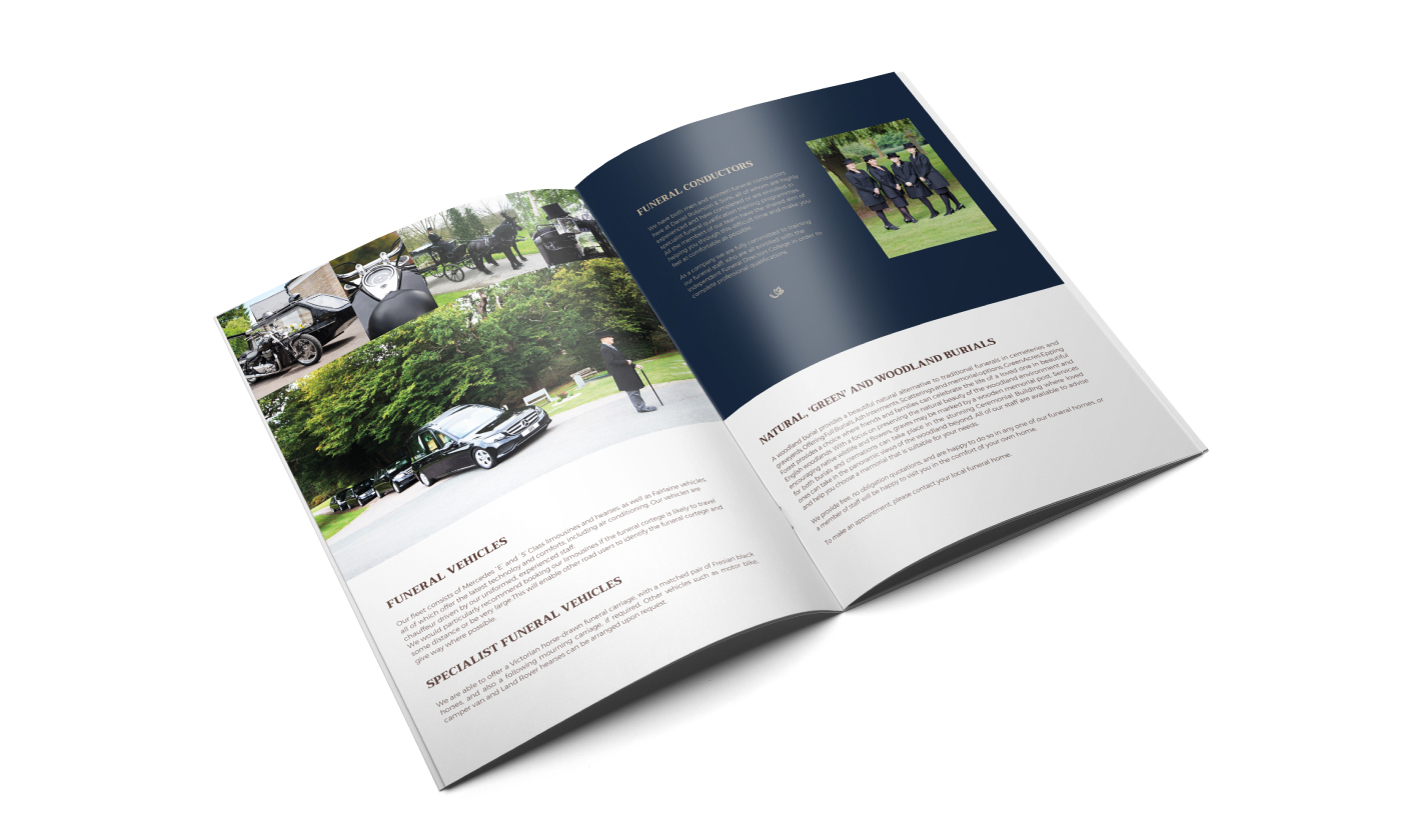
DRS is a family-run business established in 1892, offering a personal, professional service of the bereaved and the care of the deceased. Delivered by a friendly team with empathy and dedication. They treat every person and every funeral as unique. Their clients receive the utmost care and attention.
visual identity goal
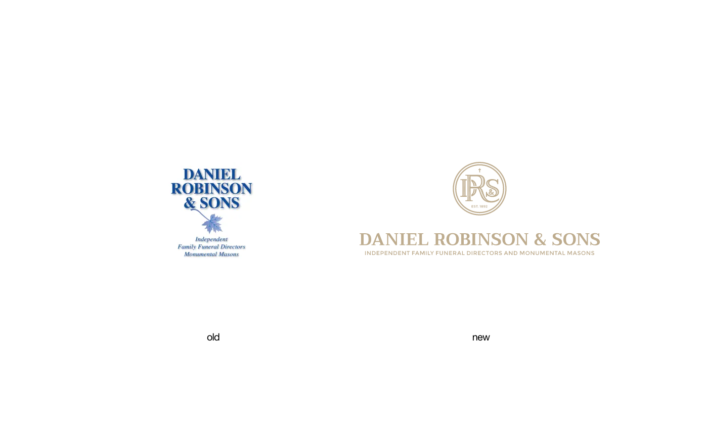
The main goal while designing a new visual identity for Daniel Robinson & Sons was to maintain the current serif-style typography but also to add more graphic elements and stylize existing ones, like the falling leaf icon, so it creates a cohesive and recognisable style.
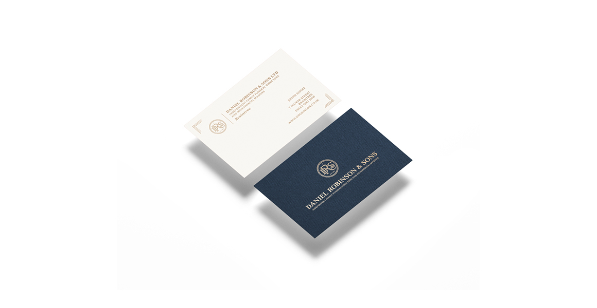
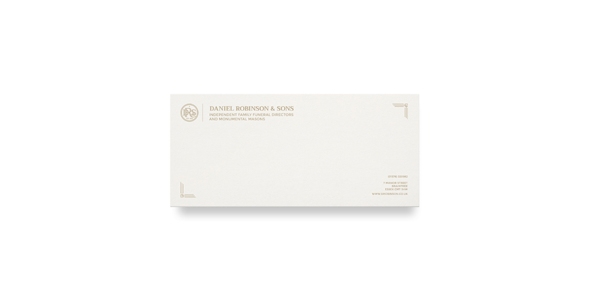
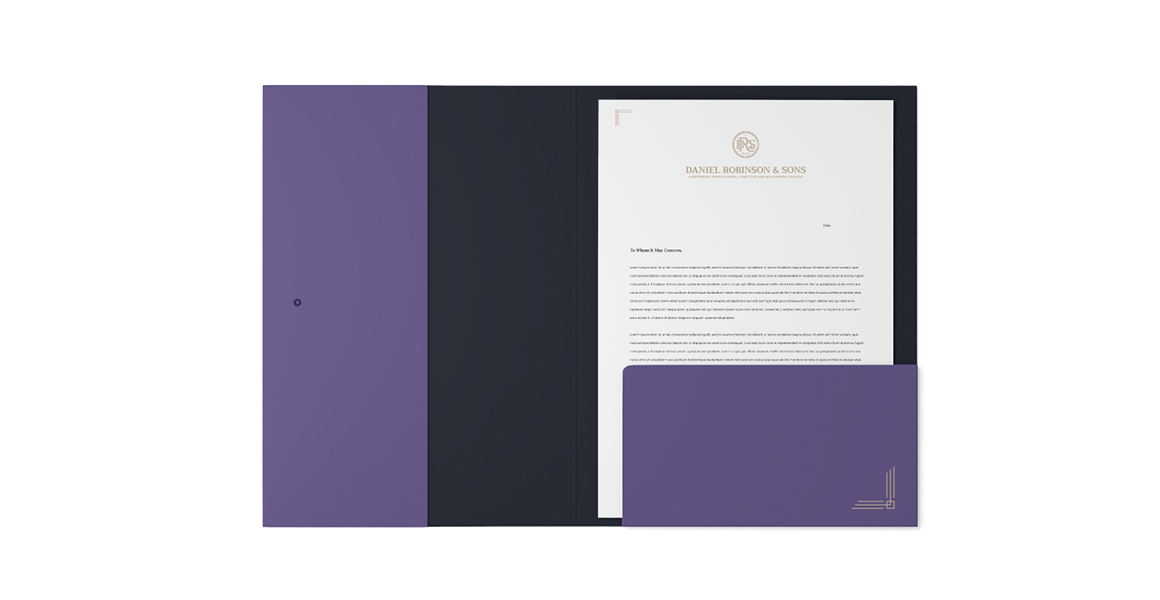
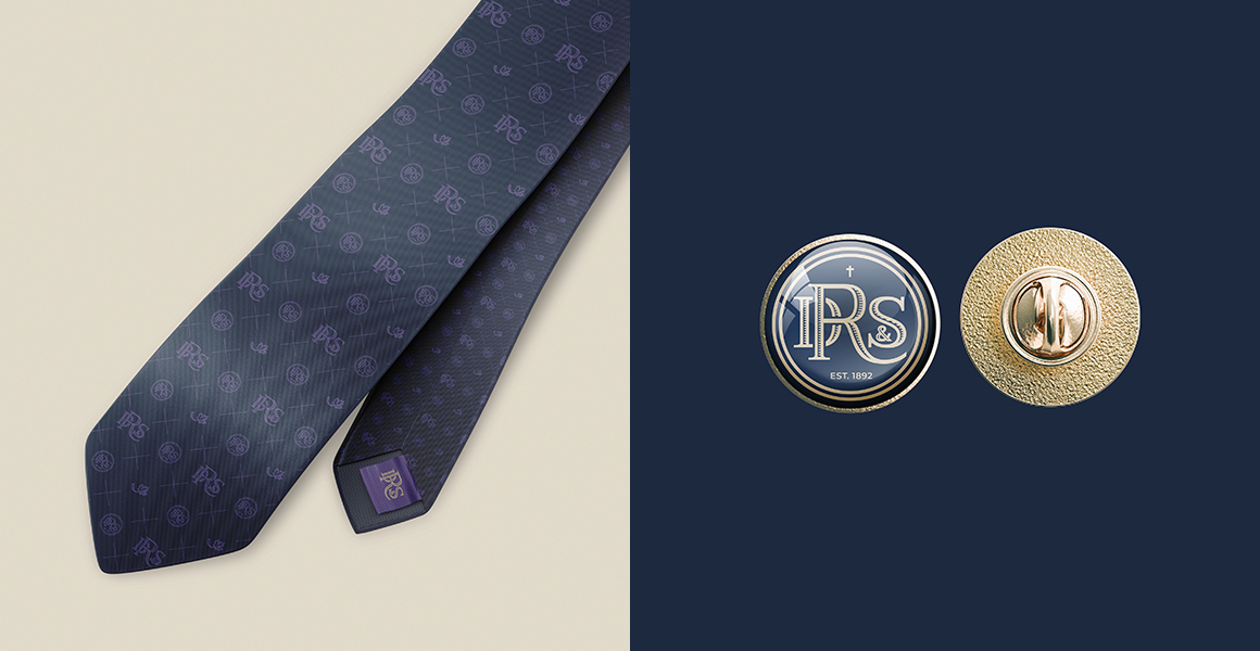
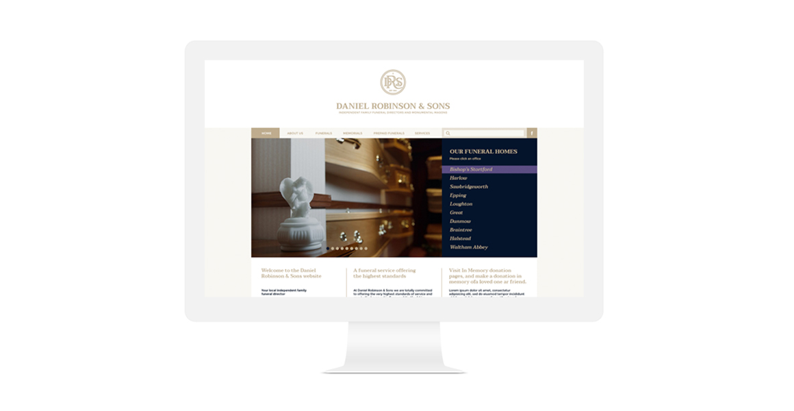
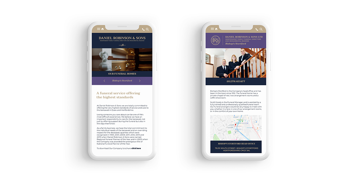
It was crucial to build a visual system that is flexible and could be used across all digital platforms and traditional printed materials.
scope:
- logo system
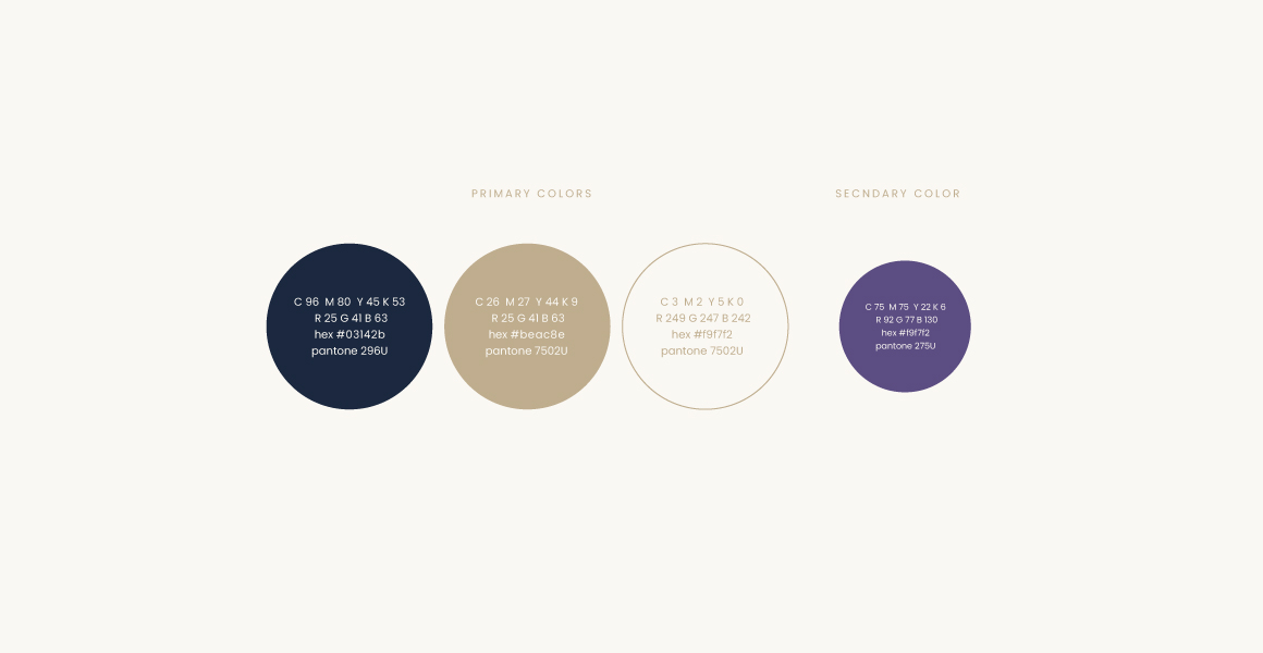
- typography & colour
- brand identity
- print design
- website design
- brand guidelines
respecting the heritage
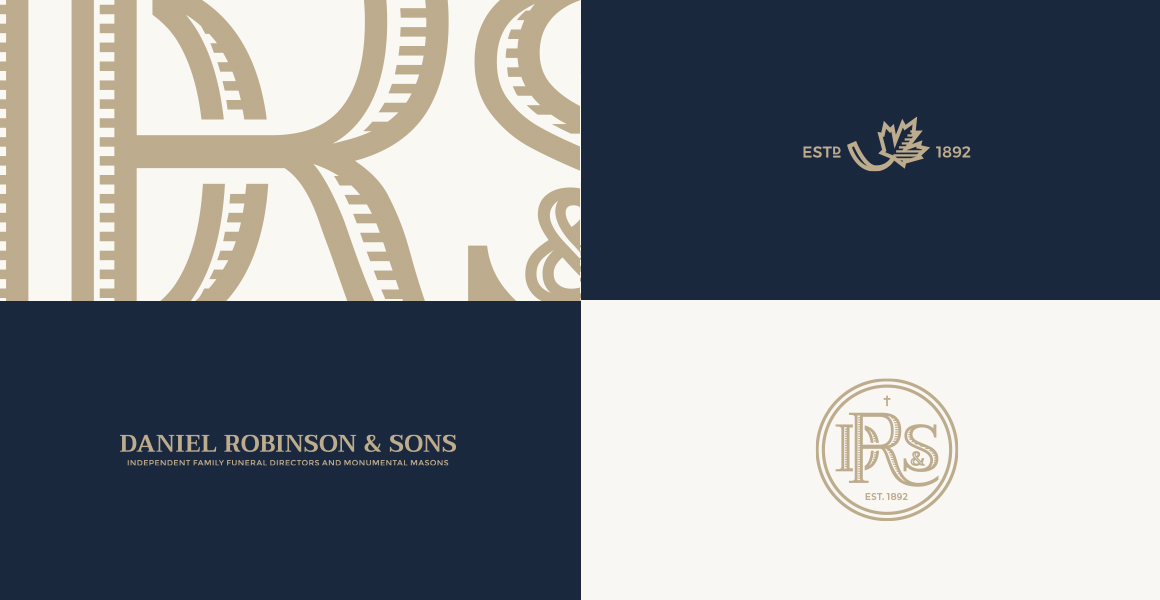
Our primary objective in this redesign was to honor the profound history of our company, acknowledging the trust and compassion that has been extended to us by generations of families in their most vulnerable moments. We wanted to create a logo that would resonate with both the loyal clientele and future generations, instilling a sense of continuity and reverence for longstanding tradition.
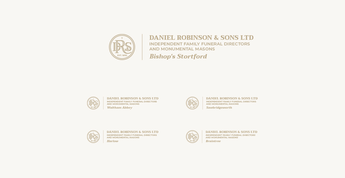
In our redesigned logo, you will find a harmonious blend of classic and contemporary elements. The refined typography exudes a sense of elegance and dignity, reflecting the respect and care they bring to every service provided. The monogram has been meticulously designed, embodying the enduring values of empathy, solace, and support that they have upheld throughout history.
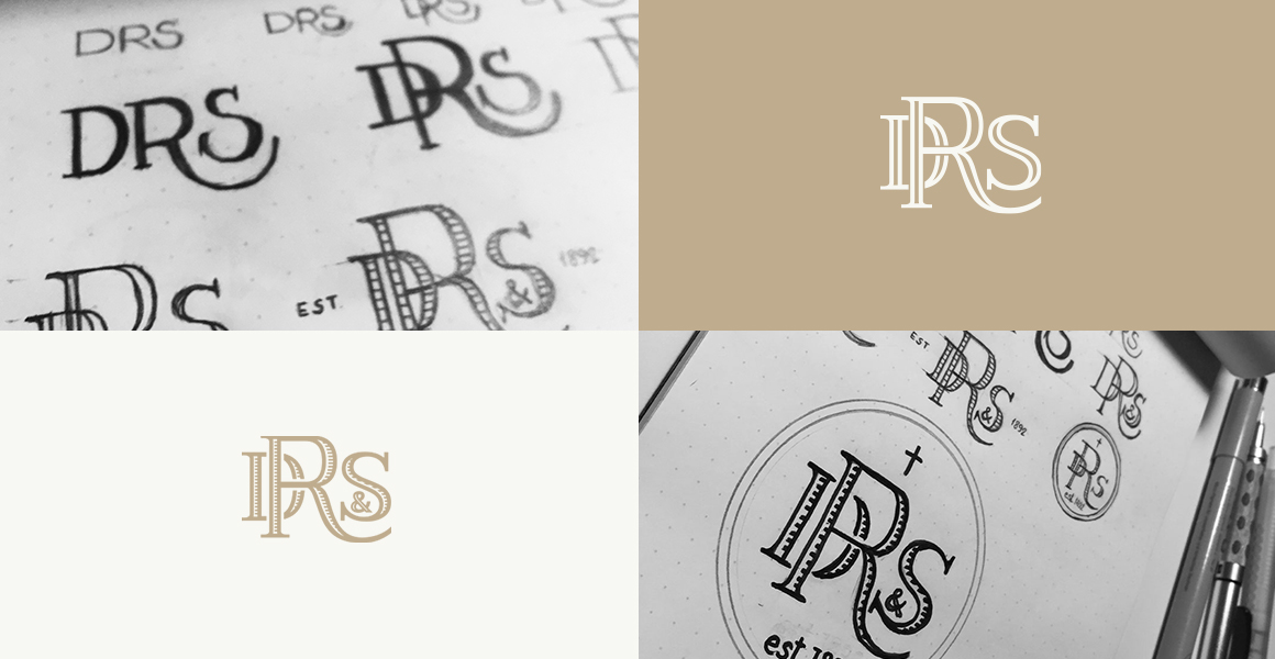
this is how we did it
With each iteration, we carefully examined the unique essence of the funeral services company. We sought to encapsulate the legacy of compassion, support, and solace that has been at the core of their mission since its founding.
As the sketches began to take shape, we delved deeper into the exploration of monogram designs, seeking an emblem that would authentically represent the brand’s values. These sketches were a reflection of our commitment to creating a logo that could stand the test of time while resonating with both loyal clients and a new generation of families seeking the services.
The exploratory phase allowed us to experiment with various typographic styles, meticulously selecting letterforms that harmoniously blended tradition with contemporary aesthetics. We wanted our redesigned logo to convey both dignity and compassion, capturing the essence of the company’s legacy while embracing the evolving needs and expectations of those they serve.