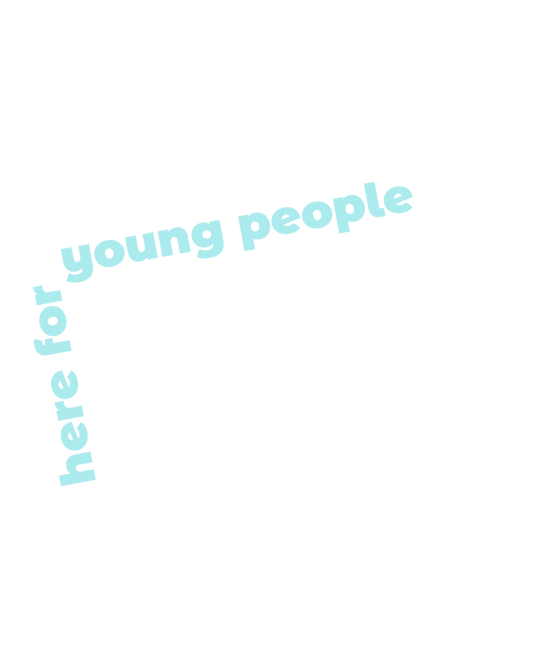
here for young people
Brand Identity
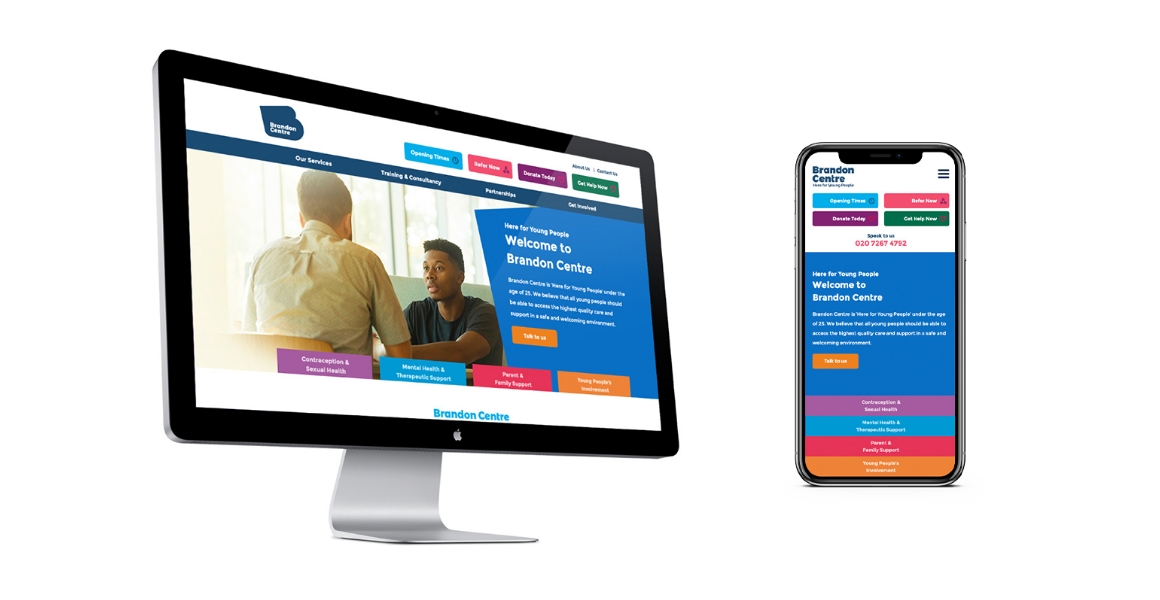
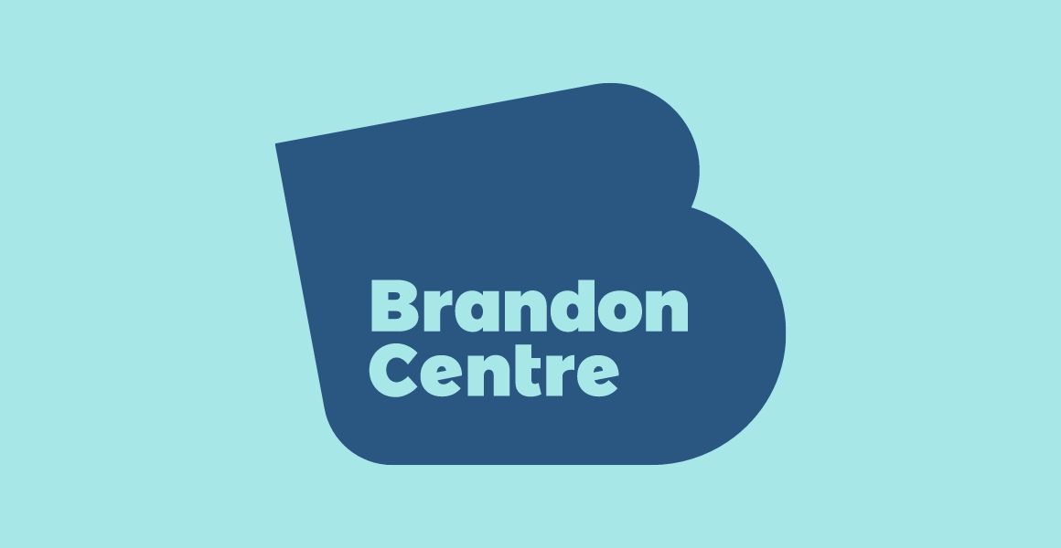
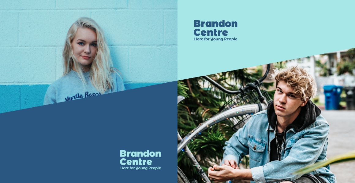
Brandon Centre
Brandon Centre is ‘Here for Young People’ between the ages of 16 and 24. They believe that all young people should be able to access the highest quality mental health and wellbeing support in a safe and welcoming environment.
www.brandon-centre.org.uk
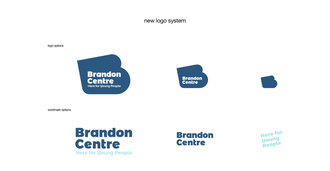
new identity
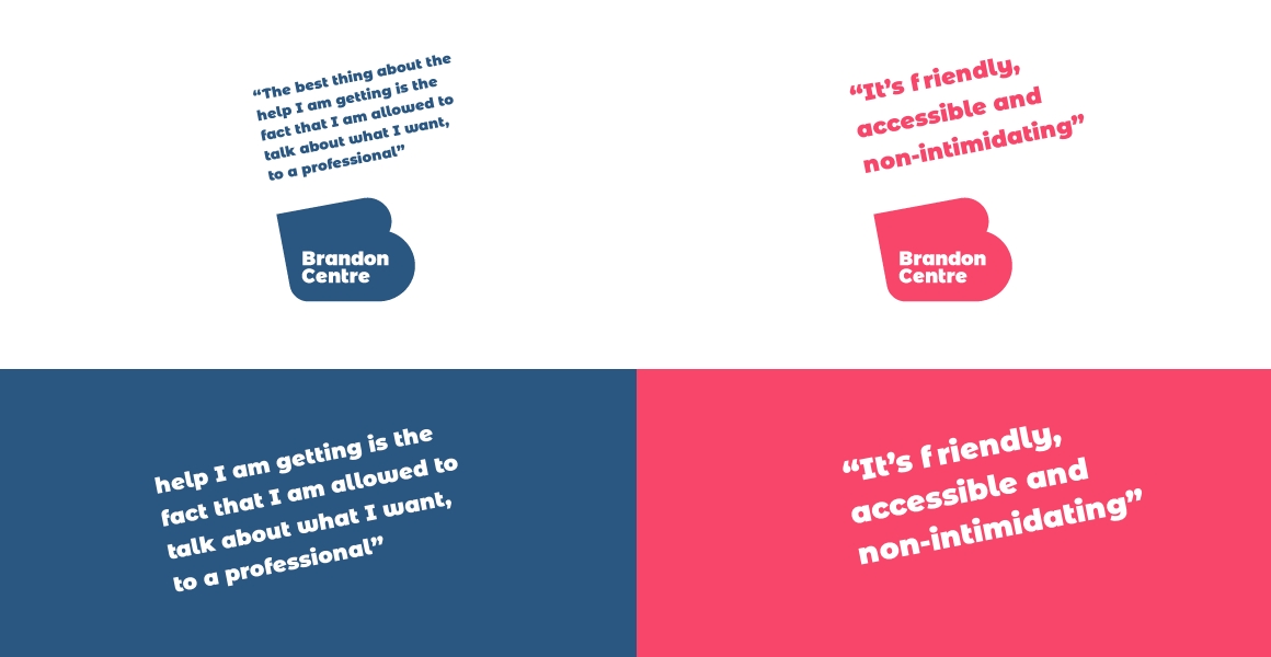
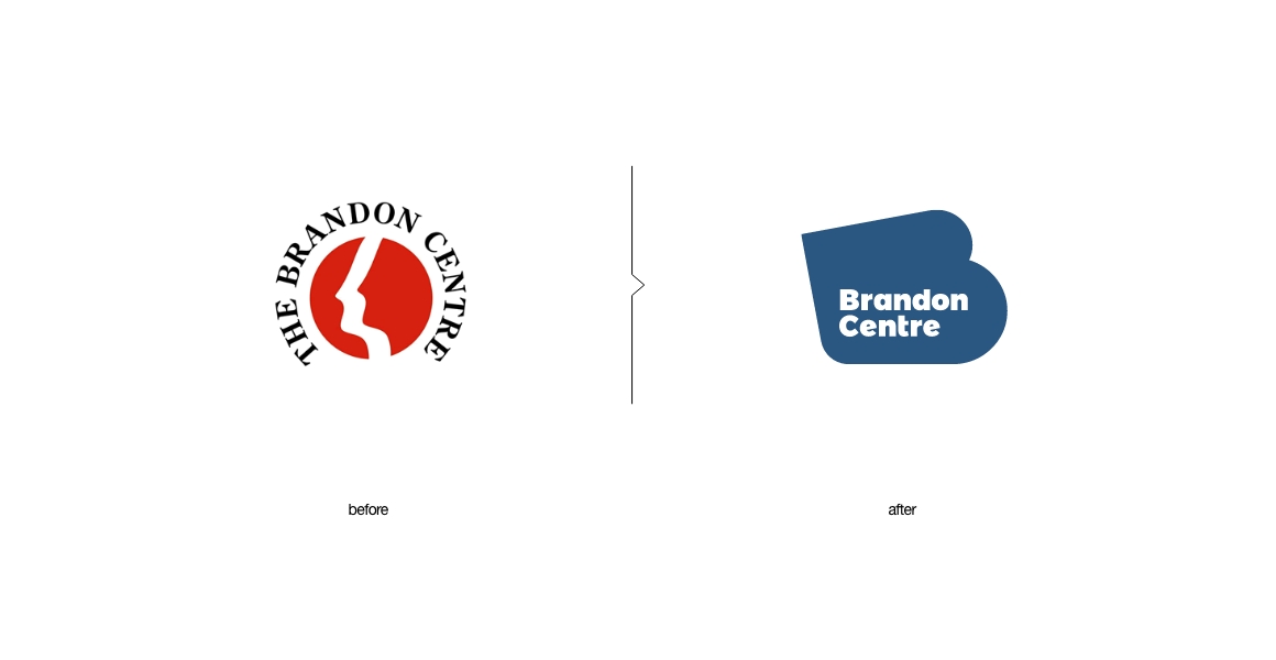
The charitie’s new logo introduces an abstract skewed icon / ‘B’ monogram that looks good at a quick glance but that seems slanted upon closer inspection. This was the goal – to find the element that will combine everything together. All the skew and angled elements create a whole new visual language that can be used in various applications. Its strong and bold voice is impossible to be missed or ignored.
scope:
- logo system
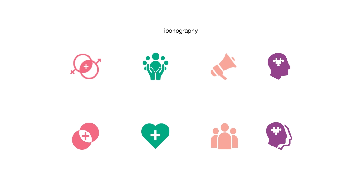
- typography & colour
- brand identity
- visual language
- brand guidelines
- website design
- print design
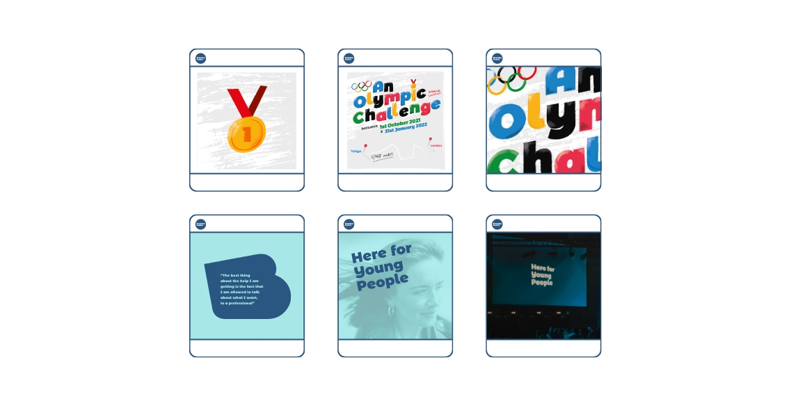
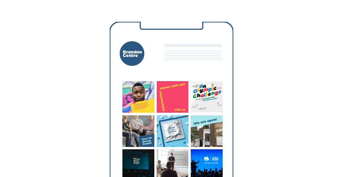
- social media
insight
The old logo was literal, with the person profile in negative space suggesting Brandon Centre from the charity name. Pretty effective but also very strict, direct and quite limiting. The rebrand was needed to move the charity further, forward and outwards. The new brand identity and the visual language were a great way to demonstrate change – for the better.
brandon’s way
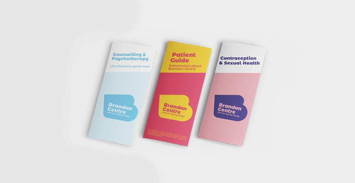
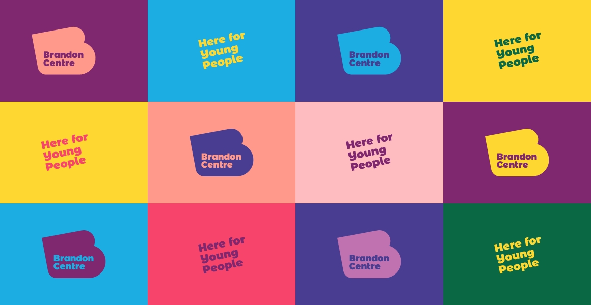
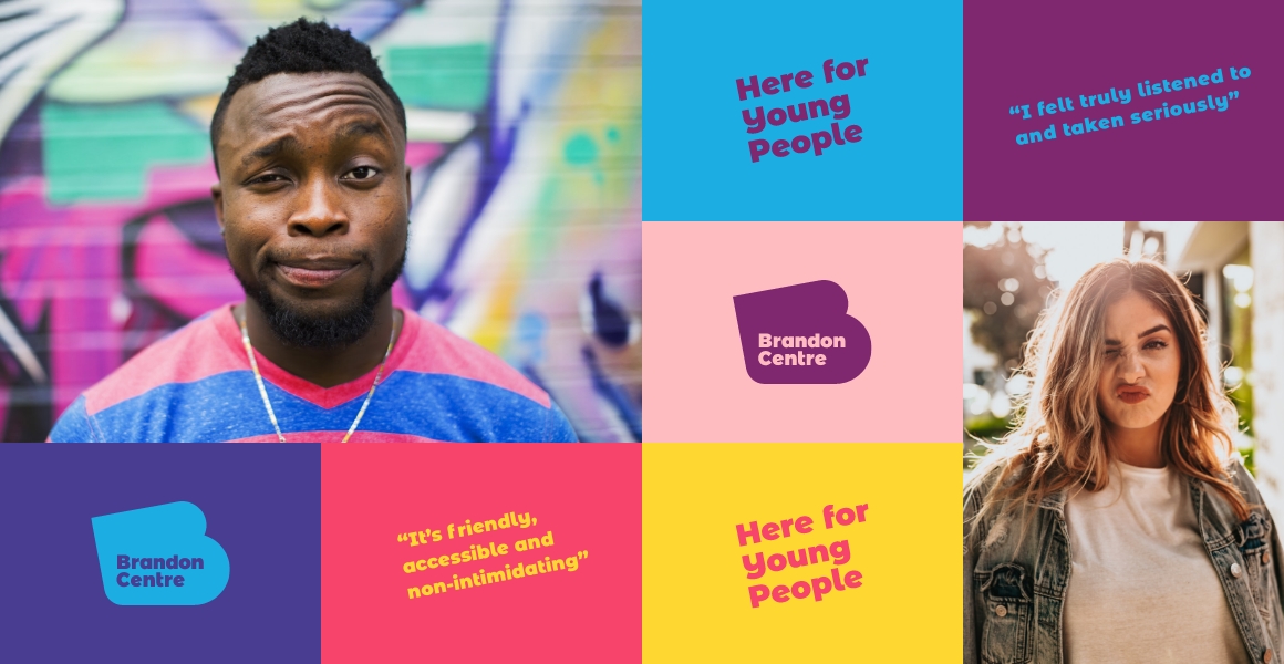
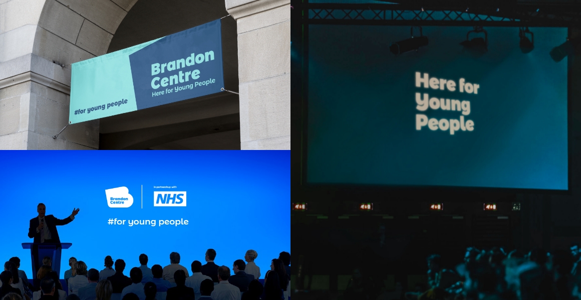
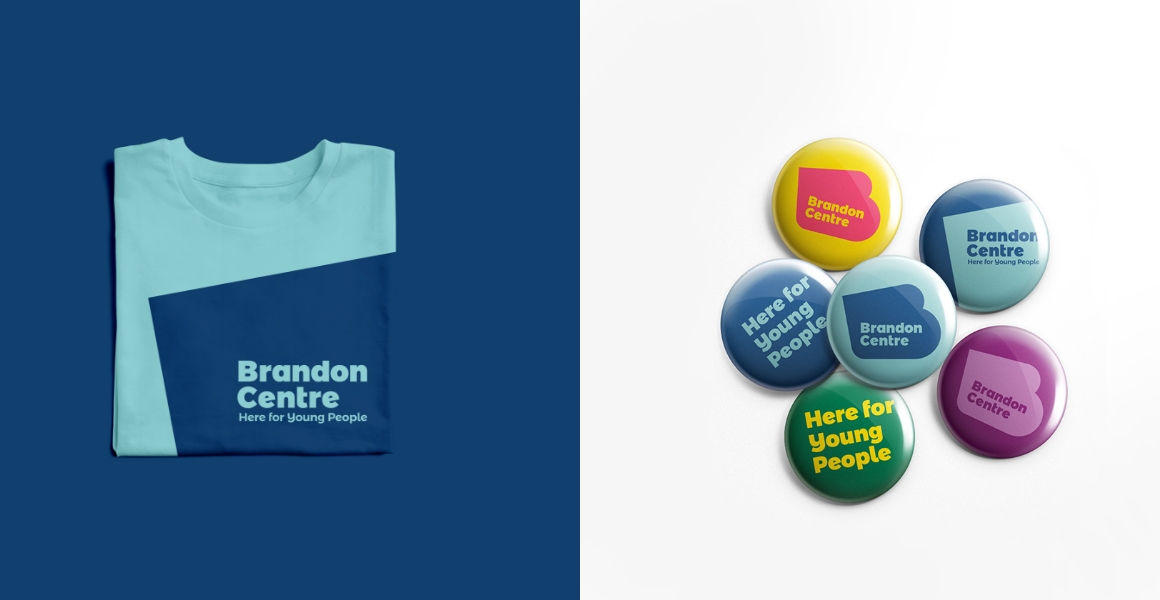
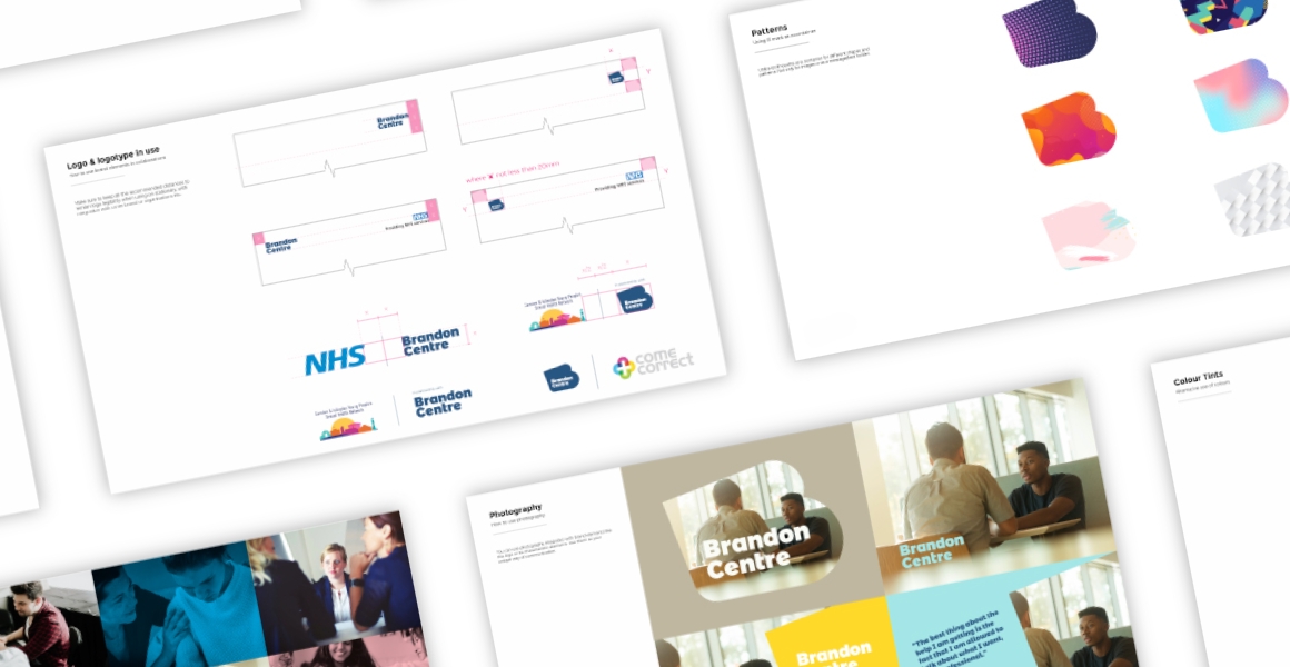
We believe that good use of the angled motif in combination with their brand colour palette, unique strapline and photography gives a great range of communication possibilities.