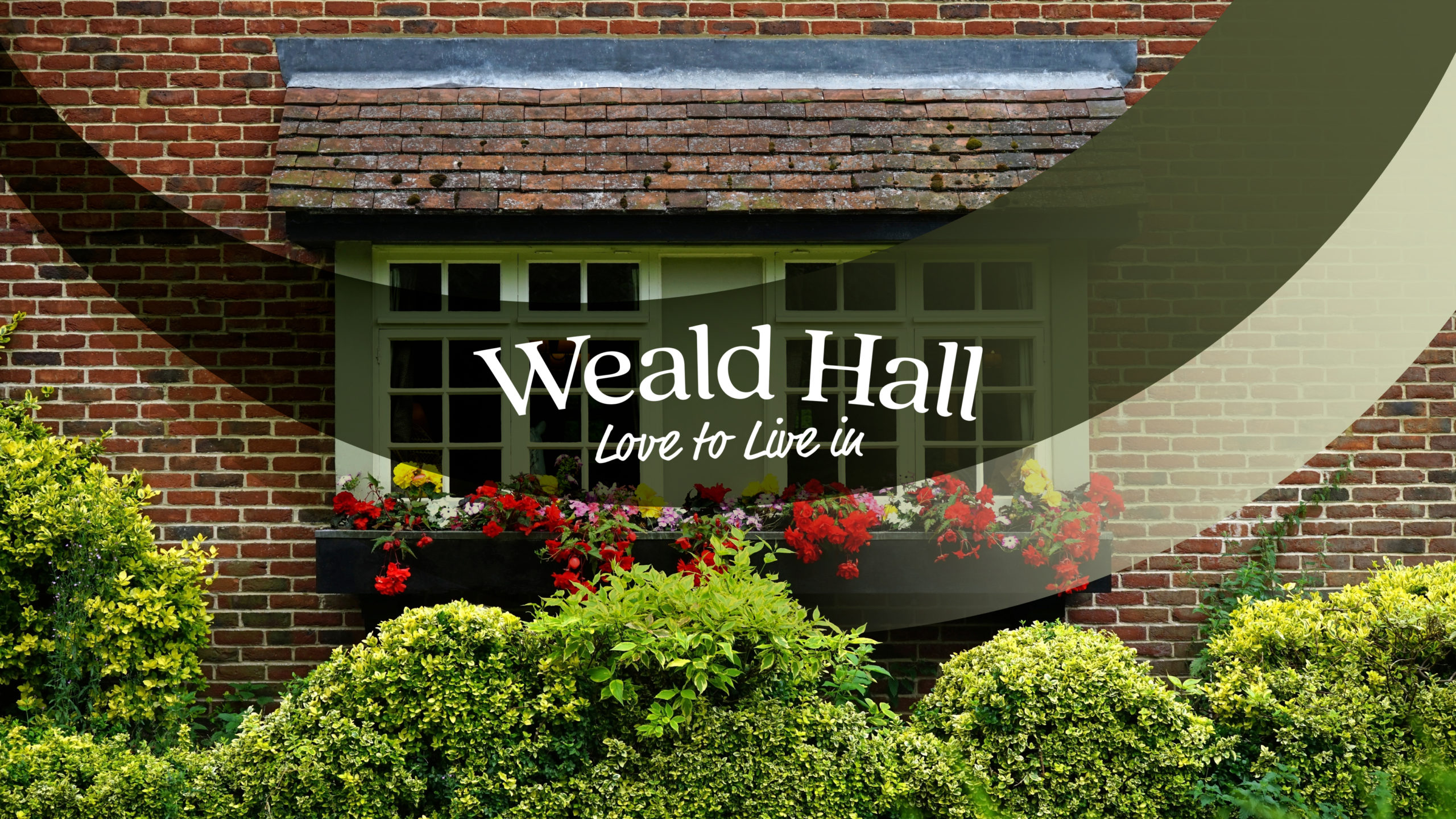
love to live in

Brand Identity
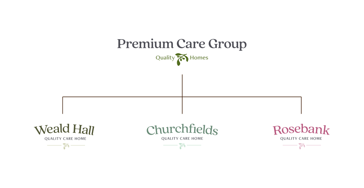
Premium Care Group
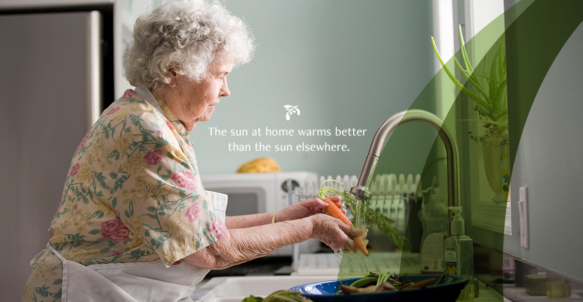
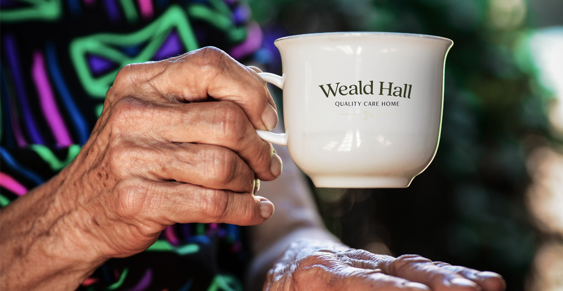
Our loved ones are extraordinary people. At PCG, they create extraordinary places and ways to celebrate every day, every moment. Each home is to be exceptional, filled with loving and caring energy. They wanted to create boutique residential homes that are intimate and where everyone matters from elderly wellbeing to their staff satisfaction. These places are to be homes at first. Homes that you love to live in.

new visual identity
PCG is different from other similar organisations. It is focused on people first not on profit. It embraces life. Making quality boutique care homes where everyone matters is their core value. The aesthetic and visual language needs to be equally professional and approachable. The look should reflect PCG’s mission of caring about people and their wellbeing. We are creating a unique way of extolling the benefit of residential homes. The look will be bold, and reassuring and communicate great service and strong values. PCG as a ‘mother company’ that manages many residential homes (up to 50) will have a friendly, subtle, and professional-looking logotype that evokes the company’s openness and friendliness.
scope:
- logo system
- typography & colour
- brand identity
- visual language
- brand guidelines
- website design


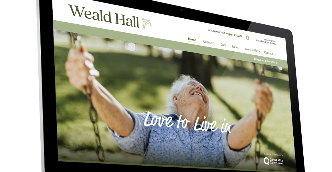
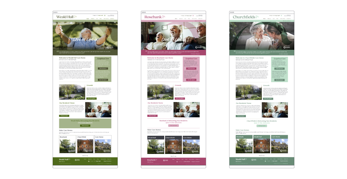
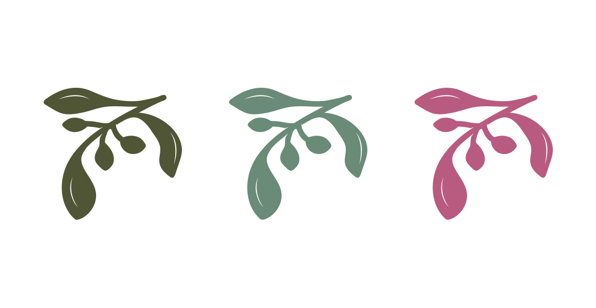
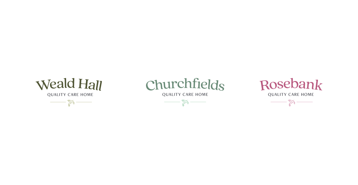
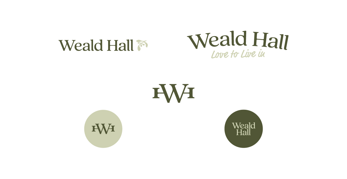
unified by symbol, distinguished by colour
The new visual identity for care homes for elderly people revolves around a central symbol, an olive branch, which represents peace, harmony, and wellbeing. This symbol serves as the cornerstone of the identity system, unifying all the care homes under the company’s umbrella. Each care home is distinguished by a unique colour palette, complementing the olive branch symbol and reflecting the individuality of each location.
The olive branch symbol is meticulously designed, featuring graceful and flowing lines that capture the essence of care and tranquility. The branch is adorned with lush leaves and olives, representing growth, vitality, and abundance. The symbolism of the olive branch conveys a sense of hope, renewal, and nurturing, aligning perfectly with the care and support provided to the elderly residents.
digital integrity
Through this new visual identity system, the care homes for elderly people convey a sense of unity and professionalism while honouring the uniqueness of each location. The olive branch symbol, combined with carefully curated colour palettes, creates a visual representation of the compassionate care, tranquility, and individuality that define each care home, ensuring that residents feel safe, comfortable, and valued within their chosen community.
The combination of consistent structure, visual hierarchy, distinct colours, and captivating imagery results in a seamless browsing experience that captures the unique essence of each care home. Our websites not only provide necessary information but also offer a visual journey that invites you to envision yourself or your loved ones in a caring and nurturing environment.